Wednesday, 12 March 2014

Jack Couvela Brief: Assassin's Creed: Character Sketches

Here are some of the early sketches I did for my Assassin character.

Selected design.

I tried to think about my character's costume in a practical manner.  I wanted a lot of his armour and weapons to be concealed for the most part, so I designed a step by of how his costume layers up (more for my own sake, than anything else)  Firstly, just normal clothing.  Second, protective armour plus weapons.  Third, how the coat conceals this.  And finally, fourth, how he looks in 'Assassin' mode.

Similar to how Edward moves in AC: Black Flag, I wanted my character to have his hood down when the player is just walking around, exploring etc.  But he put's the hood on when moving in restricted areas, or during main missions.

Jack Couvela Brief: Assassin's Creed: Character Research

Jack Couvela, from Ubisoft Reflections, has set a brief in which we need to design a new setting for Assassin's Creed.  The design can placed in any time period we like, and we need to design a character, a weapon/prop and a building designed around the climbing/free-running aspects of the game.

Sweeeeeeeeeeeeeet!!!

I'm a big fan of the Creed games, so this should be fun....hopefully.  For a couple of years now, I've been wishing they'd focus a game based in Victorian London.  I think the design of the city, the narrow streets and tall buildings will be ideal for the main character to scramble around.  The games are also synonymous with history, visiting landmarks, tweaking bits here and there for story purposes (which I love) and London is obviously embedded with a deep, rich history. What if our Assassin was framed for the Jack the Ripper murders?  What if he has to break into Buckingham Palace or Parliament?  Or scale to the top of Big Ben?  To me, it's ideal.

So, I decided to focus on the character first.  I wanted to create a great sense of believability with my character's costume.  You have to be able to look at him and instinctively know what time period he's from.  So, pulling in form lots of sources, I had a wealthy amount of reference material handy...

...a pretty intense amount of research if I'm honest.  One thing I was concerned about though was the fact that Victorian London people wore a lot of dark clothing.  And the famous white hood of Assassin's Creed would stand out.  HOWEVER, I remembered that the character Ezio wore a black costumer (in Revelations, I think??)  and it just looks...cooler.  So, I'm going to maintain a similar style in my character.

Next up,  sketches!

Friday, 7 March 2014

Shelly Page Brief: Boudica: Final Pieces

I wanted to create two Final Pieces for Boudica.  The first one being a clean cut piece of design, something useful as if I were passing it over to a 3D modeler or designer.  Another one being a more 'concept' piece that places the character within her environment to give a bit of context about the world she lives in.

Enjoy.

Shelly Page Brief: Boudica: Development

So, I began my process with doing some fast grey-scale sketches.  I had a good idea of what I was wanting to achieve, so this went very quickly.

After selecting my design, I moved quickly into a painting pass.  I like to keep up a sense of pace and momentum with the early stages of an image.  Plus lots of coffee helps...

As I was wanting to keep this quite a 'real' image, I used a heavy use of photo reference and textures.  In hindsight, it was too much.  It was bogging down my design and making adjustments difficult.  Which is good, as it's useful to learn from mistakes.

So, fueled by another gallon of coffee, I broke away from this bad habit...

...and with the use of textured brushes, began creating a character that I felt belonged to ME rather than relying on the photo reference.  At this point, the lethal dose of caffeine began to wear off, which was good as I needed to calm down and focus on the smaller intricate details that make the image look more believable.

Thursday, 6 March 2014

Shelly Page Brief: Boudica: Research

After flicking through the list of names on the brief again, I wasn't entirely sure who Boudica was.  So I did some digging and thought that this could be an interesting character to update.  My idea is to bring her forward place her in an 'adult fantasy' genre like Game of Thrones, of which I think is an ideal setting,  So I started doing some research and gathering reference materials (see below).  I want to her have a tribal feel but, since she started an uprising, I thought it would make sense she picks up pieces of armour/equipment here and there from slain enemies.  Therefore making here better equipped and a stronger warrior.  So there would be a mish-mash of armour.

One thing that's been bugging me for a while now is how female warriors are depicted in games and concept art.  You can see in some of the references I have below, that a lot of these females don't wear very much clothing............why? 
According to my research, Boudica was part of a Celtic tribe in who died roughly in 60-61 AD.  A Celtic Tribe in Britain.  It would have been bloody freezing!!  Also, what good is a warrior/fighter if over half of their body is exposed flesh with zero armour??

No no no.  My version of Boudica is going to practical.  She's going to be warm and protected.  This is something I feel I HAVE to have in my design.

Shelly Page Brief: Beauty and the Beast ABANDONED

So I settled on a design of Belle that I like and began painting the Final design.  However, I became increasing uninterested in the design.  It felt as though all I had achieved was create a contemporary version of the famous gold dress Belle wore in the Disney film.

I hadn't created a 'new' take on the character.  Merely updated her costume.  If I was bored painting her, then I imagine others would be bored looking at her.

Belle wasn't working for me anymore, so I've abandoned 'Beauty and the Beast' and decided to choose a new character from the list.  Below is some of the painting development of Belle.


Friday, 28 February 2014

Shelly Page Brief: Beauty and the Beast: Belle Re-Designs

I wasn't overly happy with the Sci-fi design I did of Belle earlier.  The problem I had was, if you looked at the design, you wouldn't instantly make a link between the character of Belle and my painting.  Not without being TOLD the back story, which isn't good.  So I'm going to approach it in a more traditional fashion and recreate the famous gold ball-room dress that will, hopefully, create a more obvious connection.

So here's some quick designs...

Ron Ashtiani Brief: Vehicle Design: Final Design


Ron Ashtiani Brief: Vehicle Design: Painting Development


Saturday, 22 February 2014

Shelly Page Brief: Beauty and the Beast: Belle Final Design?...maybe not...

I worked up the design of Belle to a finishing point, but by the time I finished, it didn't feel...right.  Although I like my design, I don't think it's suitable for the character of Belle.  Although a wanted to create a 'moodier' character, I think I've lost the sense of innocence that comes with her.

I think I'm going to start again!


Friday, 21 February 2014

Shelly Page Brief: Beauty and the Beast: Belle Designs

After digging through some research, I began working out some black and white sketches...


Choosing a design I liked, I moved forward into further painting developments...


I developed the painting to a point where it was nearly finished.  This gave me an opportunity to experiment with the UV lighting idea I had...

Tuesday, 18 February 2014

Shelly Page Brief: Beauty and the Beast: Research

I wanted to take a break from the Vehicle Design brief and started working on something different.  Shelly Page set an additional brief based around character design.  From a list of characters she provided (including the likes of Sherlock Holmes, Helen of Troy and Hades) we had to redesign this character in a modern day/futuristic or even alien world setting.  Going into this brief, I already had an item of some of the things I was wanting to achieve with my character designs, so I chose Beauty and the Beast.

So, first things first, the research...


The most obvious resource for this was the Walt Disney film.  However I decided to dig into the background of the original fairy tale and tried to ignore its existence.  From the story, there's no defining description of the 'Beast'.  Original drawings that accompanied the story many years ago have different takes of the design, including large boars to goblin/devil designs.  It was mainly from the 1930's - late 1990's where the more Werewolf designs started taking place.  But even now, that's beginning change as interpretations of classic 'monsters' are being reinvented.  Unfortunately I think this might be due to the Twilight phenomenon.  The 'Beastly' image is a good example of this.  So I started thinking outside the box a little, and thought of other classic relationships between a female lead and a 'creature'.  So I looked at films like An American Werewolf in London and even, to an extent, Alien and Alien3.  A idea started forming of what I was wanting to achieve with this relationship.

I wanted to set my characters in the future, so I started looking at 'modern' fashions designs for male and females...


I also stated having another idea I wanted to experiment with.  I want the Beast to look human for the most part.  However, in different lighting (mainly ultra violet) I want his appearance to become more ghastly.  So I did some research and the colour difference wit UV lighting too.


Let's start cracking out some designs!

Thursday, 13 February 2014

Ron Ashtiani Brief: Vehicle Design: Colour Rough


To try and help establish a sense of mood for my vehicle, I did a quick colour pass.

Ron Ashtiani Brief: Vehicle Design: Re-design


After a bit pick of feedback, I added some tweaks to my design.  The main issue was the was the body being too low to the ground as well adding additional wheel space.  I've also gone through and made some of the surface edges more hard edged (rather than ultra smooth) to mimic a more militaristic style.  I'm starting to feel more comfortable with this design.

Happy days!

Sunday, 9 February 2014

Ron Ashtiani Brief: Vehicle Design: Research and Thumbnails

We've given the brief by Ron Ashtiani to design a vehicle based around his futuristic 'Neo-Racer' brief.  The brief asked a for car design that has been created by a Military based company.  The car needs to be fast and aerodynamic, yet maintain a military feel.  Other aspects of the vehicle design  also include lethal weapons, it can fly for a few seconds at a time ("...falling, with style...") and must have a minimum of three wheels (no motorbikes here).

Fair game.

Vehicle design isn't necessarily my thing, so I was looking forward to the challenge.  But first things first.  The research...


Though military in it's origins, this is still a racing vehicle.  So I looked at chunkier sports cars mainly.  Nothing too smooth or ultra-modern.  I also had a look at some military vehicles, the Tumbler from The Dark Knight trilogy as well as some concept art from Iron Man.  Why Iron Man??  I want my vehicle design to store and hide away it's weapons in a practical manner, the same way Iron Man does with his suit.  Not all of his toys are on display all at the same time.  So I wanted to see how the intricate panels on the suit work and see if I can transfer this to my car.

Next was my initial thumbnail designs...

My first pass of designs consisted of drawing quick and fats by hand.  This didn't last long as it ended up in an exercise of extreme irritation.  So I moved over to digital.  I began with black and white paintings (how I normally begin painting characters and environments) but found myself in trouble as my loose style wasn't really working for the vehicle.  I was concentrating on the tones rather than the actual DESIGN.  So, I started again in digital, but purely sketching, which turned out quite useful.  Early in my designs I couldn't help but be influenced by the Tumbler from The Dark Knight.  It's such a unique design, I knew I had to avoid this like the plague as my design would only turn out as a "Tumbler rip-off".

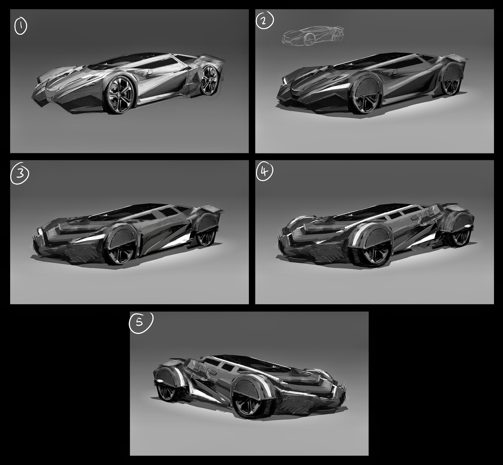
Once I pinned down a couple of designs, I moved back to black and white painting to add some weight to my design...


I focused mainly on one of my thumbnails sketches and started fleshing it out further.  I was mainly to work out the balance between sports car and military vehicle, whilst keeping in futuristic elements such as neon lighting.  Again, I was trying to move away from links to the Tumbler, but due to the chunky paneling, I also realised this design could easily start looking like the Delorean from Back to the Future.  Another element I want to avoid.  However, between designs 3 and 4, I think I'm starting to find a balance.

Onwards...